


Kontact Icon Sketch
Introduction
Background
While skimming The Dot for news today, I noticed an entry about the Kontact Logo Competition which stated that there was now a big prize attached to winning the competition itself. I was already interested in joining the competition, just to challenge my creativity and to inspire others to do the same, but now it seems even more likely I'll send in some finished artworks.
The competition is, in short, about designing a logo for the so-called Kontact application, a groupware and personal information manager application that increases productivity, communication and efficiency. It's also a handy tool for organizing a lot of data and for reading news feeds. Quite a versatile front-end for a host of applications as you might have already noticed.
Today, I started making sketches for icons and logos and I soon figured out I needed Inkscape to model them on-screen. That's why I'm now able to share some of my thoughts and designs in the early stages of the logo. I hope you enjoy this creative journey.
The Sketches
The Bitstream Vera capital K
It's no secret that the Bitstream Vera font family is the official KDE font for communication and published materials. It seemed a good idea to start off with a capital K and see what could be made out of it. The first idea was an envelope, so I fired up Inkscape and created a simple envelope sketch.

Not bad, I thought initially, especially the landscape oriented one looks like an envelope. But I wasn't about to stop here yet, so I tried coming up with other ideas regarding the Kontact parts. Up next was a clock idea, also using the Bitstream K.

At first, it seemed like a good concept, but it looks kind of bland and visually unbalanced so I kind of derailed it for possible reuse later on.
Exploring primitives
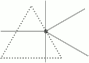
By now, I had already exhausted two of the primitive shapes: a square and a circle. That kind of left me with a triangular shape, and the only thing I could come up with was a Dark Side Of The Moon-esque prism which would reflect lines in a K shape. Being fresh out of ideas at the moment, I drew a triangle and some lines.
That surely wasn't going to win me anything, so it was time to try again with the other primitives. I made silhouettes of the K on a variety of backgrounds, in the hope it would look nice.

The K is too bold and the logo generally doesn't go anywhere for any of the backgrounds, so this concept was quickly moved to the imaginary trash can.
Pie in the sky
The circular silhouette made me wonder about how the K would look if I made it a pie-chart, since it already looked like it. Well, nothing too bold for my vector skills I came up with something I'd rather not show, but alas, for the interest of the reader I'll include it.

It's not really good enough for anything, so again time to move on.
Combining concepts
This is where things get interesting I thought: being fresh out of simple primitives and simple ideas to try it was time to check combinations of concepts I had already sketched. How would a clock and envelope look together, using the Bitstream Vera K? The only way to find out was to compose a scene with both logos.

Sigh, that's not something you'd want to reduce to 16 by 16 pixels and still be able to make out what it's supposed to be. Let's try the opposite: large envelopes, small clocks. On a sidenote, I hope I do not forget to type the letter L in the word clocks anywhere.
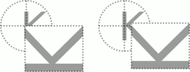
Still not what I'm looking for, but I will soon come back on the right logo of the ones directly above because it made me come up with another design.
If you can't beat 'em
The clock and envelope had me beaten: there was no way I could combine them comfortably like in the current Kontact logo without being unintelligible at lower sizes. So, instead of trying different concepts, why not repeat a single concept? OK, multiple clocks wouldn't make sense, but multiple envelopes do.
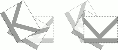
I like these, especially the one on the right. I thing this concept would be great for the start of an icon, but for an application logo, it's kinda bland. Anyway, I'll remember these two logos if I ever need them.
Then it hit me
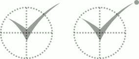
I'll probably regret sharing this already, but I hope it's for the good of the community. Looking back at the rightmost large envelope, small clock logo you will notice something I intended: the bottom part of the clock-K blends into the envelope-K. No big deal, I must admit, especially not since it was meant to be this way. But if you look at it from a distance, as I did, you'll something because of this.
Look again, from a distance, at the rightmost logo:
The two K's blend together in a checkmark sign. This was the moment I had been waiting for, a small Eureka, but I was about to do another big discovery soon. I first designed a clock and an envelope using a checkmark sign.

Sharp. Dynamic. Fun. These checkmarks really make the logo shine, but it was about to get better.
Then it hit me, again
The contest stated that extra points would be awarded for making the new logo blend in with the current Kolab logo. Visit the Kolab site now and try to figure out what I realized when looking at the logo again.
It's the ball.
In case you still don't see where I'm going, check these logos out and find the differences:

The ball forms the link to the Kolab logo. The ball makes the set of primitives complete in the envelope logo: a square for the envelope, a triangle for the checkmark and a circle for the ball. I liked it, it just needed some more tweaking. The end result sketch has got a tweaked checkmark and a small gradient in it:

It's not finished yet, but I really like this concept and I will finalize it in the next days so I can have a nice submission for the competition.
Other ideas
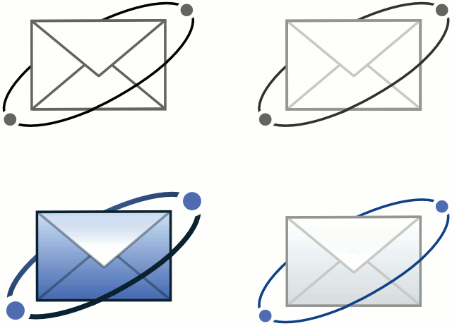
I added this chapter after writing the initial article, because I came up with some other ideas. The first one, in sketching stages is a concept I made using the orbiting balls.
Show me the money
If you want the SVG sources, just head over to this page.
On to KDE-Artists
I'll submit this article to the KDE-Artists thread shortly, so that others can have a kickstart in designing a logo. I hope this short article provides a good starting point on what not to do.
Read on
I wrote a continuation of this article here, it finishes the loose ends on the final sketch.
This article was added on the 16th of August 2005, with the addition of the Orbits concept on the 28th of August 2005.