


Inkscape Text Tricks
Introduction
Background
I wrote this article because I wondered for a while why Inkscape apparently wouldn't let me make inline text and font changes to text objects in my drawings. I used Inkscape even before the project, or fork, was started, when the main codebase was still called Sodipodi. At the time of writing, the most current version of Inkscape is 0.43 and later versions should exhibit the features I'm presenting here.
The problem I address in this article is because the discoverability of the functions and features in Inkscape is virtually non-existent. After you've read through this article you'll probably know why you didn't already know how to manually kern characters or set the baseline for them.
In this article, I want to explain how you can apply the following transformations or font styles to individual characters, or character selections, with a single Inkscape text object:
- Applying bold style
- Applying italic style or oblique
- Setting the vertical baseline
- Manually kerning
- Rotating in 90 degree steps
- Arbitrary rotation
Let's start with the font styles.
Font Styles
Make a bold statement, partly
In the Inkscape Text And Font dialog, accessible using Ctrl + Shift + T you can set the font and style for a text object. These settings work on the full object however, and you can't apparently change the font style for only a selection of the characters. But it is possible.
The feature for applying a boldface font style on a selected set of characters is actually completely hidden from the application window. By reading the documentation I found out that you can use the obvious key combination Ctrl + B to apply a bold style to the selected text. Use these simple steps to try this out:
- Create a text object and type some text
- Select a few characters within the text object
- Press the Ctrl + B key combination
- Deselect the text to watch the end result
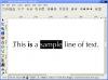
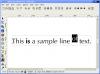
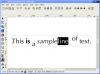
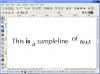
I've illustrated this process in the following screenshots:
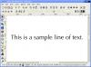
Applying a bold font style to a selection of characters in a text object.
Italic and oblique
The process for making a given selection of characters within a text object italic or oblique (ten points if you know the difference*) is actually quite similar to applying a bold style, but you use the defacto standard Ctrl + I key combination. Again, this feature is not documented anywhere within the user interface, at least not where I could find it.
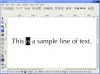
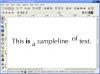
I've illustrated the process of applying an italic font style in these screenshots:
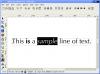
Applying an italic or oblique font style to a selection of text.
Concluding font styles
You probably already knew the key combinations I presented here, but you possibly did not know you could use them after selecting some characters in text objects. The method for doing this was actually quite simple, but invaluable when you're dealing with some typesetting in Inkcape.
The way I used to have different font styles in the same line was to clone and edit the original text object. This may sound weird, but there is really no way of knowing you can do the aforementioned tricks in Inkscape unless you read a third party manual.
You might also wonder if there is an underline option, but there isn't. Pressing Ctrl + U won't get you far, so don't try it.
Baseline Settings And Manual Kerning
Setting the baseline
Moving on to the typesetting features I'll start out with the adjustment of the baseline of characters. In simple terms this means to move the characters upwards or downwards relative to their normal position. The baseline is not always straight up, since text can be rotated. Instead, the baseline adjustment works at a 90 degree relative to the direction the text flows.
It sounds hard, but just try it out and you'll see what happens:
- Create a text object
- Select the character(s) you want to adjust
- Press Alt + Up Arrow or Alt + Down Arrow to adjust the baseline upwards or downwards
- Deselect the text to view the result
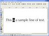
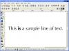
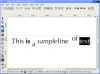
Sounds simple, doesn't it? Look at these screenshots to see how it works out:
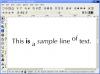
Adjusting the baseline upwards and downwards.
You can also use the key combinations Alt + Shift + Up Arrow and Alt + Shift + Down Arrow to adjust the baseline in bigger steps.
Manually kerning
Where the baseline affects the relative vertical position of each character, kerning is the process of adjusting the horizontal position of each character in a text object. Kerning is sometimes called letterspacing. You can use kerning to create the illusion of overlapping characters, often referred to as a ligature.
In Inkscape, manual kerning can be done this way:
- Select the character(s) you want to shift left- or rightwards
- Use the key combination Alt + Left Arrow and Alt + Right Arrow to shift the selection
- Deselect the text object to view the end result
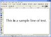
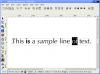
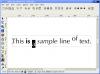
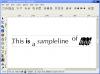
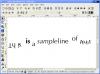
In these screenshots you can see the effect of manually kerning a word in a sentence:
Manually kerning the word "line" so it stacks up against the word "sample."
Rotation
Lastly, I want to discuss rotation characters within a text object. You can use this technique to give text a slightly slanted look, or to just rotate each character the way you want it. It's actually quite easy to do this trick once you know the key combination for it. As usual:
- Select the characters you want to rotate
- Use the key combinations Alt + [ and Alt + ] (the square brackets) to rotate the characters
- Deselect the text to view the end result
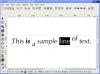
This is how it looks in action:
Arbitrarily rotating characters around their base point.
You can also rotate by 90 degree increments using the key combination Ctrl + [ and Ctrl + ], again the square brackets. You can see this demonstrated in the rightmost screenshot above.
Conclusion
Feature discoverability
It's now apparent that Inkscape does a lot more than expected, but it's hard to find out what you can do when the user interface doesn not give the slightest clue about which key combinations you can press. Luckily I found out what I wrote in this article, it saves me a lot of time and makes working with Inkscape even better for laying out pages of text and advertisements.
I hope this guide is helpful to you, and I've got one last piece of information!
Italic or oblique? Ten points up for grabs
If you read this article next time, you can score ten imaginary points by remembering this little fact:
The difference between an italic and oblique font style is that italic characters have been manually drawn to reflect a slightly slanted look, and actually look different than the regular characters. Oblique style simply means that the regular characters get skewed using a simple computer algorithm and thus are not manually crafted.
Check out this small image to see the difference:
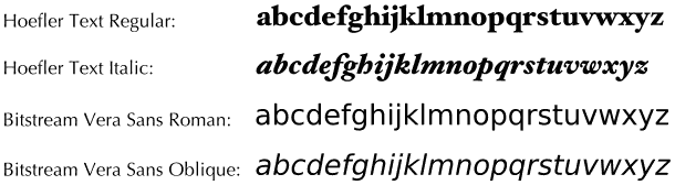
From top to bottom: regular Hoefler Text, properly italicized Hoefler Text, regular Bitstream Vera Sans and lastly computer generated Bitstream Vera Sans oblique.
About this article
This article was added to the site on the 19th of February 2006. On the 10th of March 2007 I corrected dead links after adding visual keystroke highlighting.