


BSK-Bouw Klundert
Introduction
BSK-Bouw is a local construction company housed in the small town Klundert. Back in 2004 I came in contact with the co-owner of the company, Pieter Vroegop. Seeing I had the time and skills to rebuild his then-current website from scratch and make it accessible to all users and search engines, he hired me to do so. What followed was a fairly short period in which we regularly contacted eachother about ideas taking shape.
I'll try to give a few comments on the development process and the end result of it all. If you're curious, or in need for some construction work in the Netherlands, check out the BSK-Bouw Klundert website right now.
The History
Legacy software horror
When Pieter and I first met, his site was based on a legacy software package of which I shall not say the name because it was a fine package but was lacking in key areas. The original site had a layout which was completely based on tables and rudimentary HTML code. If you don't know what that means, it indicates that the page won't be really readable for search engines and might render incorrectly on several browsers.
There was some content on the site and there were a few pictures which loaded terribly slow. I was convinced I could do better than this and so we decided I'd put in some time to come up with a redesign of the site, maintaining the page style as much as possible.
The plan
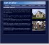
Site main page.
The ideas I had were mainly creating a new page template with valid XHTML and CSS markup, making the site a lot more accessible for search engines and non-Internet Explorer browsers. Besides the technical aspect there were some usability issues: I wrote down a new navigation scheme and page hierarchy which would allow anyone to get to the desired content within two clicks.
The page layout and design would change a bit, but I kept the visual style. The background stripes are now a leftover of the original template, the same goes for the page header with the clouds. The rest of the website design would be new, because of all the problems I experienced with the original design.
The Work
Designing the template
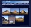
Single project page.
I chose a simple one-column design for the page because there was not a lot of content for the site. Presenting pages in a very flat way would make the page easy to understand and to scan. Keeping the visual distractions to a minimum wasn't that hard - I used images sparingly on the overview pages, while displaying large thumbnails on the content pages.
The website was and still is hosted on an IIS with ASP server, which was a new serverside technique for me. After skimming a few manuals I already felt accustomed to it and made sure the template would work well alongside ASP. Using a page template I technically separated content from layout, just like the distinction between the HTML code and CSS layout code.
The menu: to drop or dropdown?
The horizontal menu bar which spans from the top-left corner to the top-right corner has a small history. The first version of the template I did had a hierarchical dropdown menu which would offer all the available pages in a convenient cross browser dropdown menu using CSS. I sent this design to Pieter and he thought it'd be too complicated for normal use.
Well, I told him I thought it was a great technical feature of the site and it would offer one-click navigation for all pages. I left it in for the time being. A few iterations later in the development cycle the subject came up again. After a while I realized the problems with the menu and I decided to get rid of it completely. The website is much better because of it right now, as the other dropdown menu required very precise pointing with the mouse.
In the light of usability the menu disappeared and remains gone up until this day. It was worth sacrificing technical features for accessibility.
Retouching photos
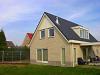
A sample photo.
There's a lot of pictures on the website, when Pieter and I started designing he literally had CDs full of pictures he wanted on the website. We concluded that as much as six pictures per project would be a good idea. We decided that Pieter'd sort out the pictures and send me the project description alongside the desired photos. He did a very good job at this which saved me a lot of trouble and time.
I then manually cropped, resized and adjusted more than one hundred pictures for display on the site. The end result was a collection of good looking and vibrant pictures ready to be delivered over the web. Looking back it took some time, but for the end result it was well worth it.
Other tidbits
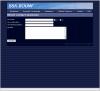
The contact form.
After the content pages related to new and renovated houses where complete, I rewrote the contact form and contact information pages. The contact form is still using the old code generated by the legacy software package that was used previously.
At a given moment in 2004 the site went live and Pieter got many positive reactions and more importantly, many requests for a quote and actual projects because of the better site. I'm glad I could be of assistance.
The Future
Maintenance, an important aspect of every site
Now that the site was finished, the time had arrived to shift it into maintenance mode. As the company completes new projects, I'm updating the site to reflect each change. This way, visitors get a current view of the company's activities instead of a dated and unmaintained project overview. Maintaining the site doesn't cost a lot of time, but it does really make the site shine.
We might look into other possibilities for the site in the future, but for now both Pieter and I are happy with the end result as it serves it's purpose well.
Related pages
Check out these pages for more information on the BSK-Bouw Klundert website: